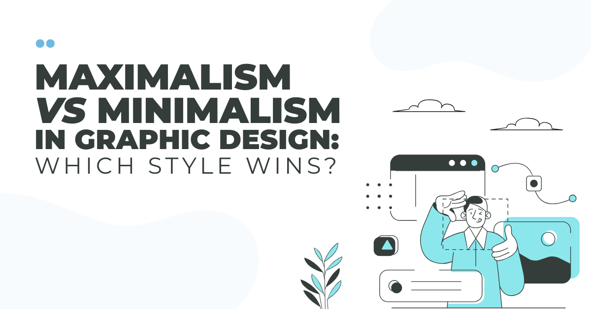
 Post by
Graphic design has always moved in cycles. What feels fresh today often emerges as a product of influence by what came before it. Over the past decade, minimalism dominated branding, web design, and visual identity campaigns. Clean layouts, loads of whitespace, neutral color palettes, and simple logos featuring sans-serif fonts became the trend.
But now, maximalism is back. Bright colors, layered visuals, expressive typography, and loud personalities are making a bold return.
So, is there really a better style in modern graphic design? Let’s compare.
The Power of Minimalism
Restraint is the key building block behind minimalism. It focuses on simplicity, clarity, and intentional design decisions. The existence of every element needs to be justified.
Fundamentally, minimalism uses:
- Clear visual hierarchy
- Subtle color systems
- Simple typography
- Clean whitespace
Traditionally, brands like Apple® have long embraced minimalism. Their visual identity relies on precision and space. An uncluttered design lets the product be the main character.
Minimalism works because it reduces resistance. When information tends to overload the digital world, clean design feels open and refreshing. Readability improves, perceived value increases, and usability is strengthened. Simplicity often signals sophistication, and as a result, luxury brands often benefit from this approach.
However, just like anything, overuse can be a weakness of minimalism. As more companies adopted stripped-back aesthetics, many brands began to look alike. Muted palettes, flat logos, and geometric sans-serif fonts can saturate the design landscape. What once felt new and cutting-edge can now feel tiring if not executed thoughtfully.
The Rise of Maximalism
Now let’s look at minimalism’s expressive sibling…maximalism. Boldness is embraced rather than restraint. Elements are layered rather than removed. It speaks loudly instead of softly whispering.
Maximalist design often includes:
- Loud, saturated color palettes
- Experimental or oversized typography
- Dense compositions
- Patterns and textures
- Dynamic layouts
Brands like Spotify® use vibrant gradients, bold type, and layouts that convey energy quite frequently to connect with culture-driven viewers. As a result, the brand feels current and alive.
This approach tends to thrive in environments where attention is hard to find. In crowded social media feeds, packed with competing visuals, striking colors, and expressive typography, posts instantly capture attention. They spark emotion, leave a lasting impression, and create a distinct human connection.
However, maximalism comes with its own risks. Without a clear structure and a strong hierarchy, it can easily feel chaotic and overpowering. When executed well, it’s intentional and dynamic; when done poorly, it’s just visual clutter.
Color: Subtle vs Loud
Color is one of the most blatant differences between the 2 styles.
Minimalist design typically centers on refined, understated color palettes, often a dominant brand color complemented by neutrals or muted accents. This strategy strengthens consistency and makes scaling across platforms easier, while conveying a sense of stability and sophistication.
The name of the game with maximalism is contrast. Unexpected pairings such as neon blue against hot pink are commonplace. The supporting elements take a back seat as highly saturated colors become the main attraction.
The emotion you’re trying to trigger will influence your choice. A calm, trusting tone or energetic excitement?
Typography: Functional vs Expressive
Sans-serif fonts usually dominate minimalist typography, making it clean and highly legible. The message is served through type and is achieved without drawing too much attention to itself.
In maximalist design, typography becomes the focal point rather than just a delivery system for information. Letterforms might be distorted, stacked, animated, or highly stylized to create impact. Custom display fonts and dramatic treatments infuse the brand with a distinct personality.
If you’re aiming to communicate clarity and credibility, a minimal typographic approach is highly effective. But if your objective is to project cultural relevance and dynamic creativity, bold and expressive type can amplify your brand voice.
Composition: Space vs Density
Minimalism emphasizes whitespace. While guiding the viewer’s eye in a controlled fashion, it allows the content to breathe.
Maximalism employs density. Overlapping elements, interacting textures, and visuals that simultaneously collaborate and complete. As a result, it becomes more of an immersive experience.
Neither is necessarily better than the other. The question is whether calm focus or vibrant intensity helps communicate your message effectively.
Finding the Right Fit
The choice between maximalism and minimalism should be about alignment, not simply following trends.
Ask yourself:
- Who is my audience?
- What emotions should my brand evoke?
- What does my industry typically look like?
- Do I want to stand out boldly or lead with quiet authority?
Blending the two is common among some brands. A minimal core identity, combined with bold campaign visuals, can offer a degree of flexibility without losing a clear message.
Conclusion
So which design choice wins? In the graphic design arena, there’s no need to choose sides. A great layout is about using the right style to communicate an intentional message to your users and potential customers.
Because maximalism and minimalism are simply tools, strategic design is the real winner.