 Post by
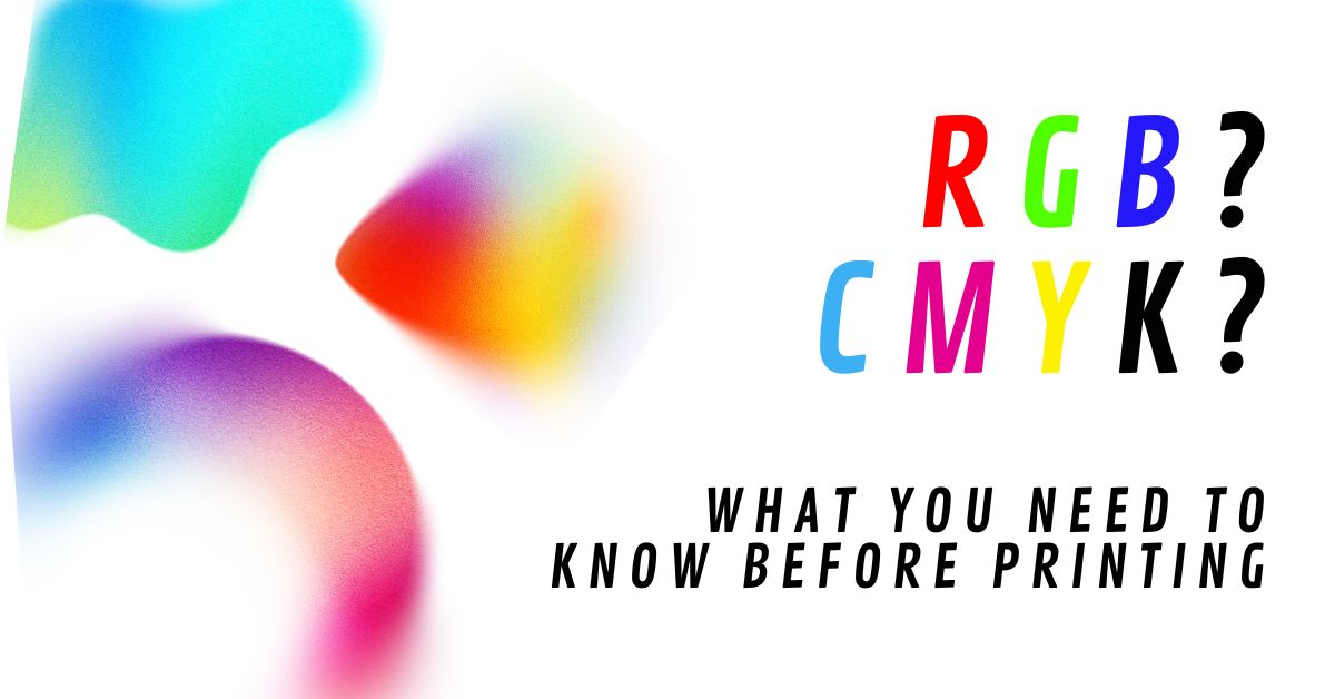
Have a brochure or flyer that you need to hand out? Things always look better when you get them professionally printed. Not only can you print all the way to the edge (bleed), but you also have access to a wider range of high-quality paper options. However, have you ever received a printed brochure or business card that looked duller than it did on your screen? The reason usually comes down to CMYK vs RGB. Understanding this difference can save you time, money, and frustration on your next print project. Let’s break it down in simple terms.
What is RGB? (Screen Colors)
RGB stands for Red, Green, and Blue, and is the color system used for anything viewed on a screen, including phones, laptops, TVs, and websites. RGB displays colors by emitting light, producing bright, vibrant visuals. This direct light creates the bold, glowing, and highly saturated colors often seen in digital designs. For social media graphics or websites, designing in RGB is effective. However, when developing a brand, consider how colors will translate in print. Some bright, saturated colors onscreen cannot be duplicated exactly in print.
What is CMYK? (Print Colors)
CMYK stands for Cyan, Magenta, Yellow, and Black, the color system used in printing. Rather than light, CMYK uses ink layered on paper to produce colors that are more subdued than those on a screen. Designers work in CMYK to ensure color reproducibility in both print and digital.
Final Takeaway: How to Avoid Common Color Issues?
To get the best results from your print projects, keep these tips in mind:
- Design in CMYK for anything that will be printed.
- Use high-resolution, print-ready files.
- Communicate with your designer or printer early.
If you want exact color matching, especially for branding, use Pantone colors. These standardized, pre-mixed inks ensure consistent, accurate results. Each Pantone color has a code so designers and printers can reproduce it anywhere.
The simplest way to remember this:
If it’s for a screen, use RGB.
If it’s for print, use CMYK.