 Post by

Logos are symbols that represent a company or organization. They can be text-based, like the retail store Marshalls, or just a symbol, like the Apple logo. They can even be a combination of both like Nike and Chanel.
Whatever a logo looks like, a lot of thought and time went into designing it. Oftentimes, designers make subtle design choices to convey a message to the customer. Here are a few ways that designers create hidden messages in logos.
Using Negative Space
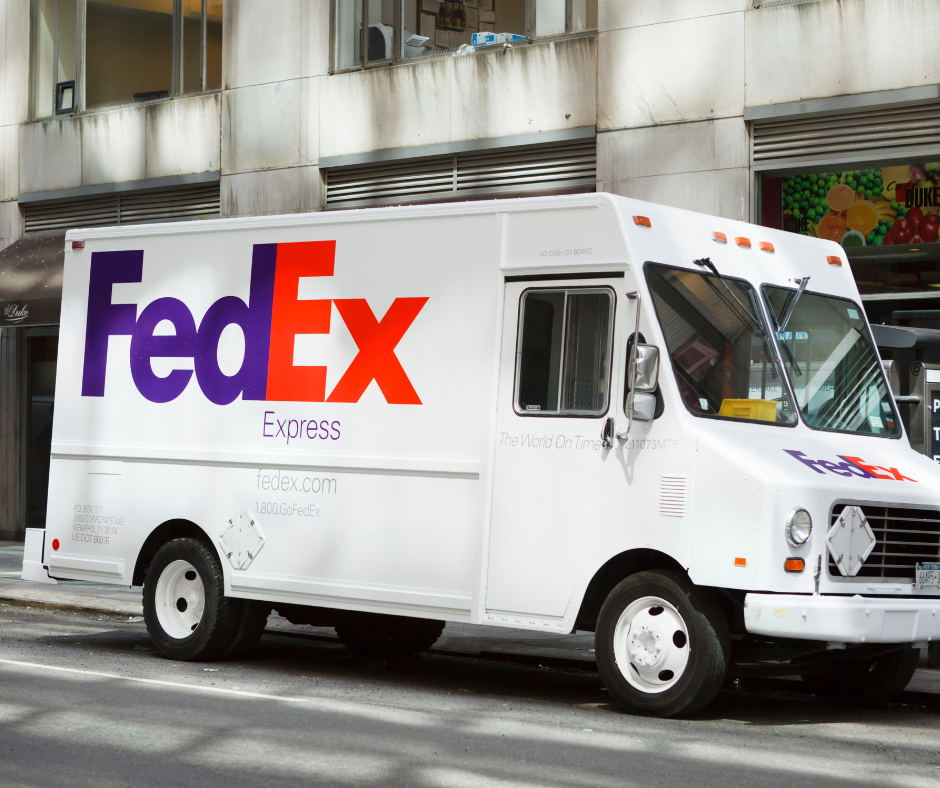
This is when the negative or white space in a logo creates a shape that has a hidden meaning. The most famous example of this is the FedEx logo. There is an arrow in the negative space created between the E and the X. It is supposed to symbolize moving in a forward direction.
Another example of this technique is in the Hershey’s Kisses logo. The negative space in between the K and the I creates a Hershey’s Kiss.
The logo for the Brooklyn Zoo also uses this technique. In the white space of the giraffes’ legs, you can see the New York skyline.
Graphic Elements

This is when you use graphic elements to create a message. We all know that the Amazon logo uses this technique. The Amazon smile is an arrow connecting A and Z, sending the message that Amazon carries everything from A to Z.
Another example is in the Adidas logo. The three slanted lines represent a mountain, which symbolizes the challenges customers must overcome.
The Subway logo has arrows pointing in opposite directions. This creates the illusion of movement and symbolizes the fact that you can have delicious food fast and on the go.
Creative Treatment to Typography

This is when you add a graphic element to the typography to send a message. A perfect example is the Chick-fil-A logo. They changed the C so that it forms a chicken, which represents the fact that they sell only chicken, unlike other fast-food places.
Tostitos is another example. The lowercase t’s form people holding a chip and the dot in the I is their bowl of salsa. This logo perfectly represents what this company sells: chips and salsa.
Another example is the MyFont logo. There is a hand formed in the M and Y, representing a human.
Color Changes

This is when you use color to create a hidden message. Baskin-Robbins’ logo uses this technique. There is a pink 31 in the B and the R, which represents the number of flavors they serve.
In the London Museum logo, the blobs of color represent how the geography of London has changed over time.
Another example is the logo for the NHL hockey team the Washington Capitals. Their logo uses color to form a W, representing Washington. Their logo actually uses negative space, too, to form the outline of the capitol building.
There are plenty of logos out there that have hidden messages. Check out this list from BestLife. As you can tell, designers put a lot of thought into creating a logo. Next time you see a new logo or even logos you’ve seen before, take some time to see if you can spot the hidden message.