 Post by
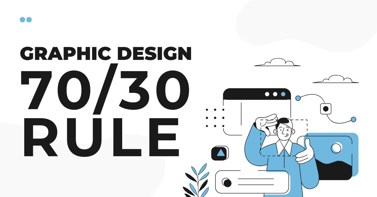
What is the 70/30 Rule?
In today’s world of visual communication, audiences are exposed to thousands of designs every day. From the online world of social media graphics and websites to the print landscape of packaging and advertisements, successful design must capture attention quickly while remaining easy to understand. The 70/30 rule offers a simple framework that helps designers achieve this balance.
So, what is the 70/30 rule, and how is it useful for graphic designers? This principle is one of the most effective guidelines in graphic design because it helps designers create hierarchy, balance, and visual interest without overwhelming the viewer or user. At its core, the rule suggests that 70% of a design should follow a dominant theme, style, or visual element, while the remaining 30% introduces variety and contrast. This balance allows creativity and emphasis to shine through while keeping designs cohesive.
Understanding the 70% and 30% Balance
The “70” represents the dominant visual identity of a design. It includes key elements such as the main color palette, typography, layout, and overall style, helping create consistency and familiarity for the audience. For example, a minimalist website might rely on neutral colors, generous spacing, and clean modern typography throughout most of the interface. This cohesive visual language establishes the foundation of the design. The “30” serves as the contrasting element that introduces emphasis and visual interest. This may include bold accent colors, distinctive typography, eye-catching imagery, or unconventional shapes. Without this contrast, a design can feel monotonous and unengaging. However, if contrasting elements overpower the composition, the design may seem cluttered and difficult to navigate.
The 70/30 Rule in Branding and Typography
One of the most recognizable applications of the 70/30 rule appears in branding. Successful brands often establish a strong, consistent visual identity while strategically using contrasting elements to emphasize important information. For example, a brand may rely heavily on monochrome colors throughout its design but introduce a bright accent color for call-to-action buttons or promotional content. This contrast naturally captures the viewer’s attention and directs focus toward key messages. The rule is equally valuable in typography. Designers may use a single font family for much of the text to ensure consistency and readability, while introducing a bolder or more decorative typeface for headings and emphasized sections. This balance creates a clear visual hierarchy, allowing readers to navigate the content more smoothly and intuitively.
The 70/30 Rule in Layout and Color Design
In graphic layouts inspired by interior design, the 70/30 principle is commonly reflected through color distribution. For instance, a poster may feature soft neutral shades across 70% of the composition, while the remaining 30% incorporates bold, vibrant colors to establish focal points and visual interest. This balance enhances the overall aesthetic while reducing visual fatigue. The principle is every bit as important in web design. Effective user interfaces often rely on a dominant, clean layout with minimal distractions, allowing users to navigate content comfortably. Contrasting elements such as bright colors, animations, or striking imagery are then used selectively to guide attention toward key actions like signing up, making a purchase, or exploring featured content. By balancing simplicity with emphasis, designers can improve both user experience and conversion rates.
Why is the 70/30 Rule Important?
For beginner designers, the 70/30 rule is especially useful because it provides a clear framework for making design decisions. Rather than creating a visual battlefield of too many competing styles or elements, designers can maintain one dominant visual direction while adding carefully controlled variation. This approach often leads to work that appears clean, balanced, and professionally refined. The ultimate goal of the 70/30 rule is to emphasize harmony in design. Effective design is not only about visual appeal but also about communicating ideas clearly and directing the viewer’s attention with purpose. By combining consistency with contrast, designers can create visuals that are both functional and visually engaging.
Conclusion
Whether used in branding, web design, typography, or advertising, the 70/30 rule remains a timeless design principle. It helps designers produce work that feels cohesive, intentional, polished, and memorable.