 Post by

Parallax effects have grown more and more popular on websites over the past 5 years. Rather than restricting your website to the traditional two-dimensional nature of the web, this is a simple way to add increased depth and dimension to your website’s experience.
The term Parallax is used to describe the effect of moving elements, such as pictures and content on your website at different speeds. There is a wide array of variations that can add a subtle hint of depth and intrigue to your user’s experience. Unfortunately, this can be overused and barrage the user with movement and content that can prove overwhelming.
To keep things simple and ensure that your parallax effects are subtle without impairing a viewer’s experience, follow the simple guidelines below.
- Keep the number of parallax effects to a minimum.
- Keep the motion contained to a smaller area of the screen rather than the entire window.
- Don’t let the parallax effect distract your users from your content and most importantly, the purpose of your website.
Around the Web
I have compiled a list of 6 websites below with varying parallax effects to give you an idea of what you can achieve with your site. Hopefully, these can inspire you and help you brainstorm how adding some scrolling effects could benefit your website.
Parallax
While this is a simple demo of a parallax effect used by many web developers, the movement of the snow in the foreground as you move your mouse across the screen is a simple yet mesmerizing and engaging effect.

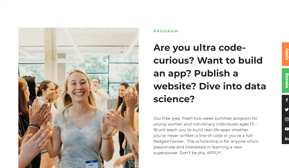
Kode with Klossy
If you are not paying close attention, you may even miss it. When scrolling through the “Programs” section of the home page, you will see the corresponding image revealing/hiding itself from top to bottom. The image appears to move down the page very subtly with you as well. This is a wonderful example of a simple parallax effect that does not hinder your content at all but gives your website a little more life.
Browser History Presented by SquareSpace
This one is a whole different beast and highlights how scrolling can create an engaging 3-dimensional experience, unlike anything that used to be on the internet.

International Women’s Day at Apple
Hopefully, you celebrated International Women’s Day on March 8th. To commemorate “the women who are changing everything,” Apple created this simple page with a wonderful parallax effect that moves the screen as you move your cursor towards different influential women in the world today. I like that this does not take an entire web page full of scrolling to achieve – just a beautiful, concise banner that leaves the control in your hands.

The History of the Web
To end the list, I included one of my favorite parallax sites that takes you on a journey through the years to see the evolution of the web. It’s three decades of growth summed up in one web page with beautiful animation.

The Goonies
Ah, the Goonies. While I do love this movie, I put the website on the list because it is a great example of another website that has a nice experience and flow as you scroll down the page. Appropriate images and content move and fade in guiding you to what is next on the page for you to consume. Way more subtle than The History of the Web above but is still able to engage you in a journey in the same way.

Summing It Up
If you enjoyed any of the websites liked above and think parallax would be a great option for your own website, try to use it on a section that could benefit from a little more depth and fun. This will give your website a more modern, exciting feel, without overwhelming users and distracting them from your important content.