 Post by
We’ve all been there: staring at a color wheel until the hex codes start to blur, trying to find that perfect combination that doesn’t just look good, but feels “right.”
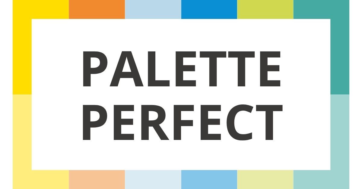
I recently picked up Palette Perfect by Sara Caldas, and it’s safe to say my approach to design has been completely recalibrated. It isn’t just a book of pretty swatches; it’s a manual on the psychology of visual storytelling.
More Than Just “Matching”
What makes Caldas’ work stand out is her organization. Instead of grouping by primary colors or seasons, she groups by emotions and atmospheres. The book is broken down into sections like:
- Minimalist: The power of “less is more.”
- Vintage: Nostalgic tones that feel like a memory.
- Exotic: Bold, high-energy clashes that work.
The book emphasizes that proportion is everything. You can have the same five colors, but if you change which one is the “hero” and which is the “accent,” the entire mood shifts from calm and airy to moody and sophisticated.
“Color is a universal language, but we often forget how to speak it fluently.”
Why You Need This on Your Shelf
Whether you’re a professional graphic designer, a hobbyist illustrator, or even someone just trying to pick a cohesive palette for your home, this book removes the guesswork. It’s a visual dictionary for feelings.
If you’re feeling stuck in a “beige” creative rut, Palette Perfect is the spark you need. It’s a reminder that color is the most powerful tool in our kit; we have to learn how to use it with intention.