 Post by
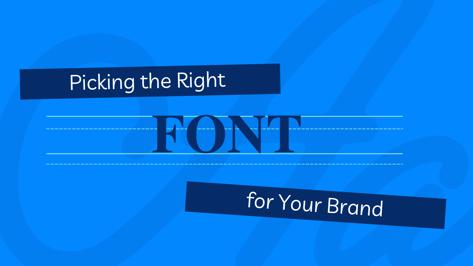
Previously, I explored how colors can impact the way someone perceives your brand. For example, red gives off an air of importance like Coca-Cola, and yellow is seen as happy, which is why a lot of restaurants use it; however, when coming up with your brand identity, there’s a lot more you need to consider than just color. The typeface you choose can also create a psychological response in consumers.
Traditional Serif Fonts
A serif is the small lines attached at the end of letters. They are often connected with a curved area. Think of fonts like Times New Roman, Georgia, and Garamond. Traditional serif fonts are often seen as a very traditional and classic choice. They are seen as elegant and stable. It invokes trust and respectability. For example, the Wikipedia logo is a traditional serif font. Wikipedia wants to be seen as a trusted source of information. Vogue, Tiffany, Rolex, and Dior all use serif fonts to invoke a feeling of elegance and a stable choice.
Slab Serif Fonts
A font is considered a slab serif when the small line at the end of the letter is abrupt, not connected by a curved area, and squared off. They have a very chunkier look and feel. Think of Rockwell and Clarendon. Slab serif fonts still invoke the same feeling of stability as a traditional serif font, but they are viewed as bold, confident, and important. For example, the Sony and IBM logos use a slab serif font. They want to stand out as a bold, confident choice that you can trust.
Sans Serif Font
A sans serif font is a font that does not have an extra line attached to the letter. It is often seen as clean and simple, easy to read, and straightforward. Think Helvetica and Ariel. Sans serif fonts are also seen as more modern. Tech companies like Google and Microsoft often use sans serif fonts to invoke a clean and modern look. Spotify has a sans serif logo as it is a new modern way to listen to music.
Companies often see the importance of font choice in their brand. Originally, Google’s logo used a traditional serif font. They wanted to be seen as an established choice for those using their search engine. However, when they rebranded, they chose a sans serif font, which made them look modern and innovative. So, when you are deciding on a rebrand or just picking a logo for your new business, you should consider a font choice that aligns with your identity.
Sources:
Feedough – Font Psychology for Logo Design
Zeka – Font Psychology in Graphic Design