 Post by
Need to pick a color for your logo? You may not know that choosing a shade for your design is not just about finding something that looks good. Color psychology shows that the colors we choose can affect the emotions and behaviors of our customers. In my last blog article, we discussed how red invokes passion, blue inspires a feeling of safety, yellow invokes happiness, and black conveys sophistication; however, what if none of these colors match your brand?
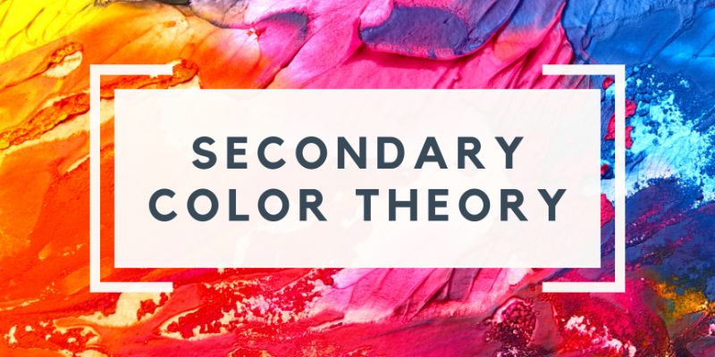
Let’s take another dive into color theory, but this time let’s discuss the secondary colors.
Green
When it comes to green, most people think of the outdoors and nature. Green is best used when conveying an organic quality. Tropicana, Whole Foods, and HelloFresh all have green logos for this exact reason. Companies also use green logos to associate themselves with the environment, like John Deere, Land Rover, and BP.
Orange
With orange being the combination of yellow and red, it invokes the best of both worlds. It is a happy color that is often seen as playful and youthful, but it is also an attention-grabbing color. Nickelodeon’s logo is orange because it wants to convey youthfulness and fun. However, there are a lot of fast-food companies that use orange to convey happiness, but also to grab your attention at the same time, like Popeyes and Dunkin’.
Purple
Purple has long been thought of as a royal, regal color. It creates a sense of elegance, without harshness as we see with the color black. Crown Royal, StubHub, and Hallmark want to convey luxury to the budget-minded consumer, and they all use purple to do so.
Bonus: Gray
Gray is a great middle ground between black and white. It is seen as a mature and serious color that often invokes a feeling of professionalism. Think about companies like Apple and Mercedes. The perception of the consumer is that they’re high up and successful in their fields. They may be expensive, but they create products that are well-engineered. In fact, if you Google “car company logos” most of them have some type of gray in their branding.
There’s so much more to learn about the emotions behind color. The color of your logo can be the difference between being seen as a playful or a serious company. By better understanding colors and how our customers may perceive them, you can more effectively convey the message you’re trying to get across.